Built for engineers. Used by everyone else.
Datamorf lets non-technical teams automate marketing and sales workflows. But the builder was engineered for developers. I redesigned the core experience, turning a technically-driven interface into one operators could use without support.


Context
Datamorf Workflow Builder
What's Datamorf?
Datamorf is an automation platform that allows users to create marketing and sales workflows connecting different tools and services. Users can define triggers and actions to automate repetitive processes. The platform had been built with a strong engineering mindset, without a clearly defined user persona, the real users were non-technical operators: marketers and sales teams who needed to build automation workflows without technical support.
Team
I worked closely with the founder throughout the project, from early research through to final implementation, collaborating with the engineering team to ensure designs were technically feasible and accurately translated into the live product.
My Role
Product Designer, I was responsible for redesigning the core feature of the platform: the workflow builder, from research and ideation through to a fully interactive Figma prototype and design system.
Challenge
Improve usability, clarity, and completion rates for non-technical users, while aligning the product with modern UX standards. Specifically: simplify the workflow creation process to reduce cognitive load, improve the visibility and scannability of connected integrations, and increase task completion by guiding users through a clear and structured flow.
Research
Datamorf Workflow Builder
Datamorf had been built with a strong engineering mindset, without a clearly defined user persona. Working with the founder, we identified that the primary users were non-technical operators, marketers and sales teams who needed to build automation workflows without technical support.
To understand where and why they were struggling, I ran four research activities before touching any design.
Competitive Audit
I analysed the workflow builders of direct competitors, studying their structure, navigation patterns, and interaction models. For each, I documented what worked, what created friction, and why. I also reviewed public user feedback and ratings to surface recurring complaints and unmet expectations. The findings were consolidated into a competitive audit table, which gave us a clear picture of industry standards and where Datamorf was falling behind.
User Flow Mapping
Mapping the existing user flow made structural problems immediately visible. To move between sections, users had to return to the main navigation menu each time, breaking their flow and forcing them to reorient repeatedly. The number of steps required to complete a basic workflow was high, and the sequence wasn't intuitive. This analysis confirmed that the navigation architecture, not just the interface, needed rethinking.
User Interviews
I conducted unmoderated task-based sessions with three power users, observing how they attempted to build a workflow from scratch. Only one was able to complete the task. The other two got stuck early and couldn't recover without guidance.
Two patterns stood out. First, users had no sense of when they were done, after reaching what should have been the final step, the reaction was "what now?", revealing a missing completion signal or next-step prompt. Second, core features like the test mode and playground were almost entirely ignored, not because users found them unhelpful, but because they didn't know they existed. These features had no visibility in the current interface.
Screen Recording Analysis
Using Posthog, I reviewed session recordings from a broader set of users to identify where frustration was building and where people were abandoning the flow. One pattern emerged clearly: the trigger setup process was broken in a way users couldn't diagnose. When a trigger connection failed, the interface showed nothing, no error explanation, no suggested fix, no path forward. Users would attempt the same action repeatedly, unable to understand what had gone wrong. The information needed to resolve integration errors simply wasn't there.

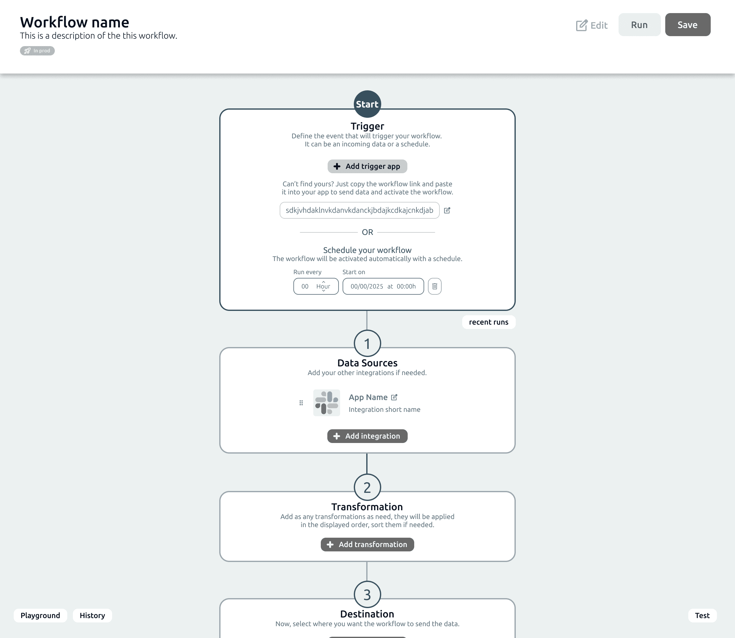
State of the workflow builder at the time the project was launched
Synthesis
Across all four research activities, four critical pain points emerged consistently:
No clear mental model: the interface reflected system logic, not user intent
Fragmented navigation: key actions were scattered across multiple sections
High cognitive load: too many options visible at once, with important features buried
No sense of progression: users didn't know what to do next, or when they were done
Hypothesis:
If we align the workflow builder with a step-by-step mental model, surface key features where users actually need them, and provide clear feedback at critical moments, non-technical users will be able to build, troubleshoot, and complete workflows confidently and independently.
Ideation & Prioritisation
With findings across all four activities, I ran an affinity mapping session in Figma with the team, gathering every insight onto individual notes, then grouping them by theme to surface the underlying patterns. From there, we ideated solutions together for each cluster, then evaluated them using an effort/impact matrix to decide where to focus first. This gave us a shared, evidence-based starting point for the redesign rather than a list of opinions.
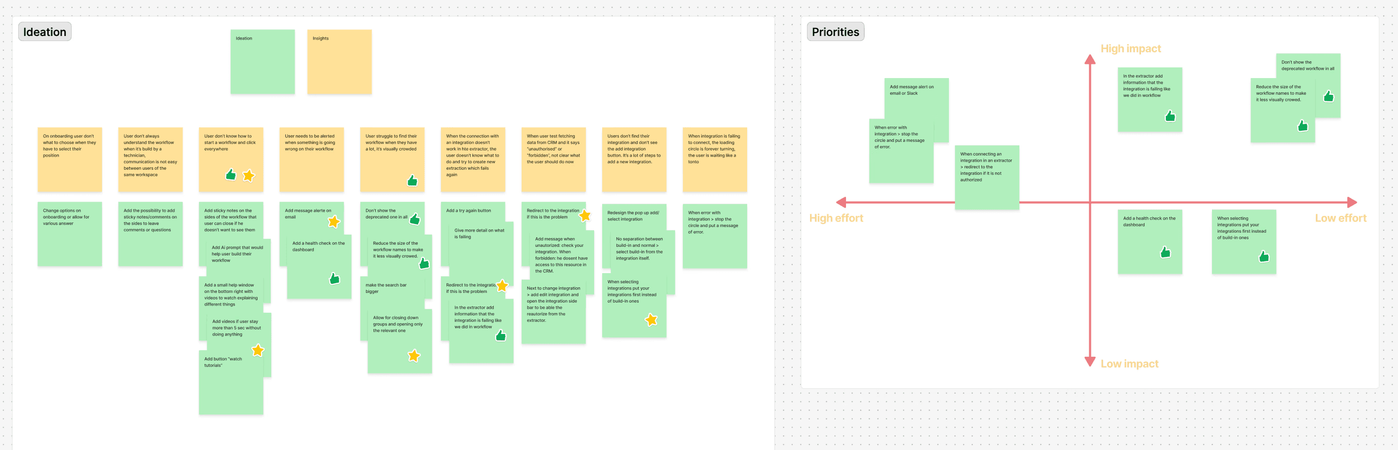
Affinity diagram & effort/impact matrix
With priorities agreed, I moved straight to paper, sketching out early structural concepts before opening Figma. Hand-drawn wireframes at this stage kept the focus on layout and flow rather than detail, making it easier to explore and discard ideas quickly.
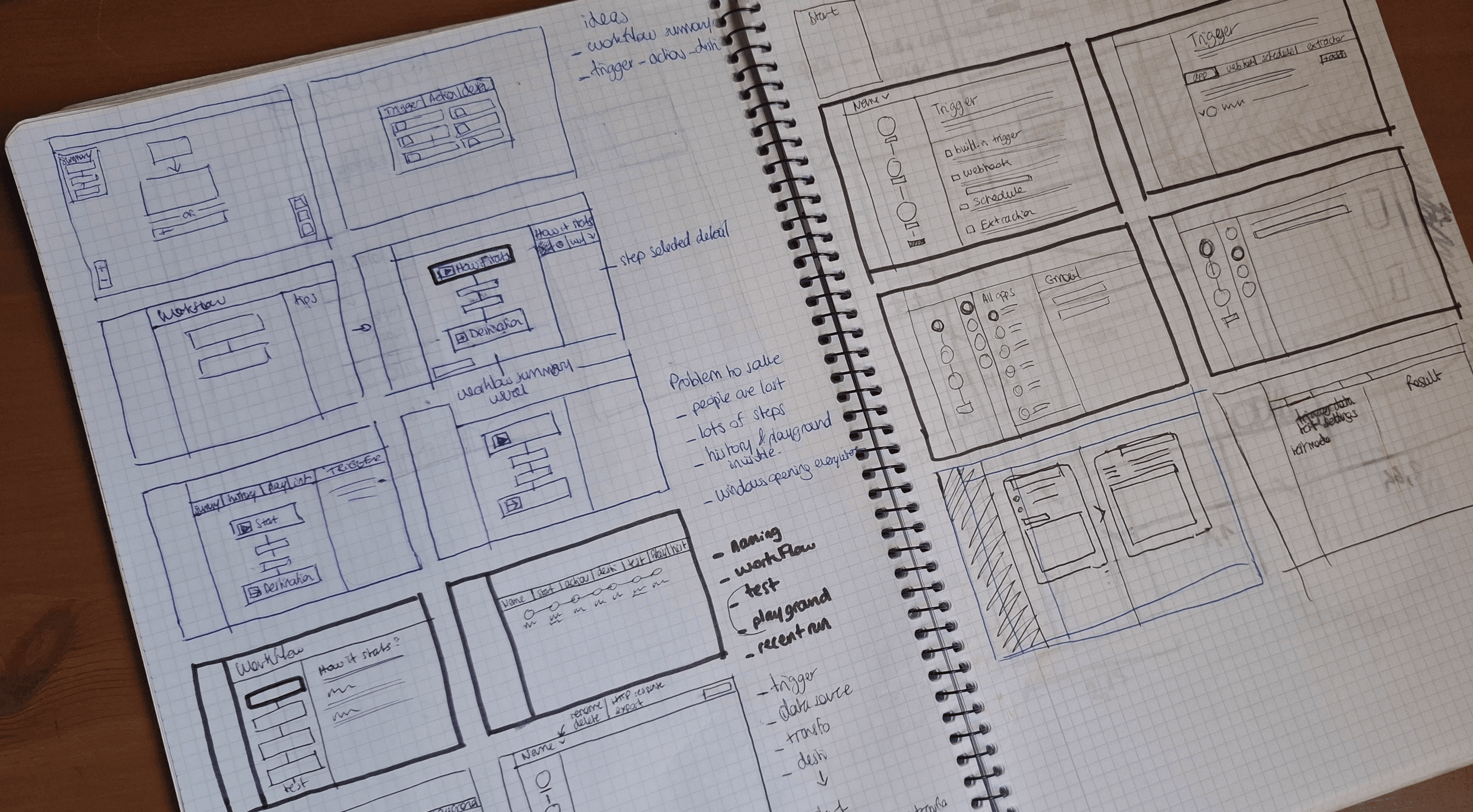
Hand-drawn wireframes of the workflow builder interface.
Iterations & Testing
Datamorf Workflow Builder
The redesign went through three major iterations, each tested with the internal team and power users. Every round surfaced new friction points and pushed the design toward a clearer, more intuitive experience.
Final Design
Datamorf Workflow Builder
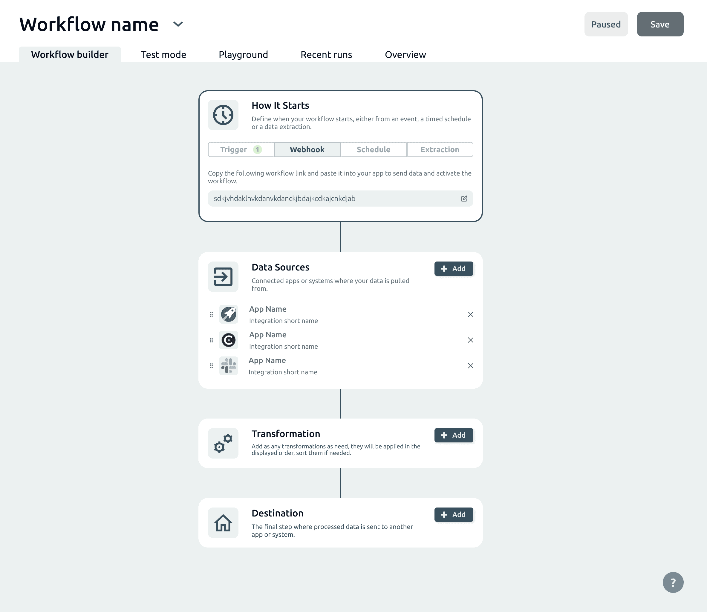
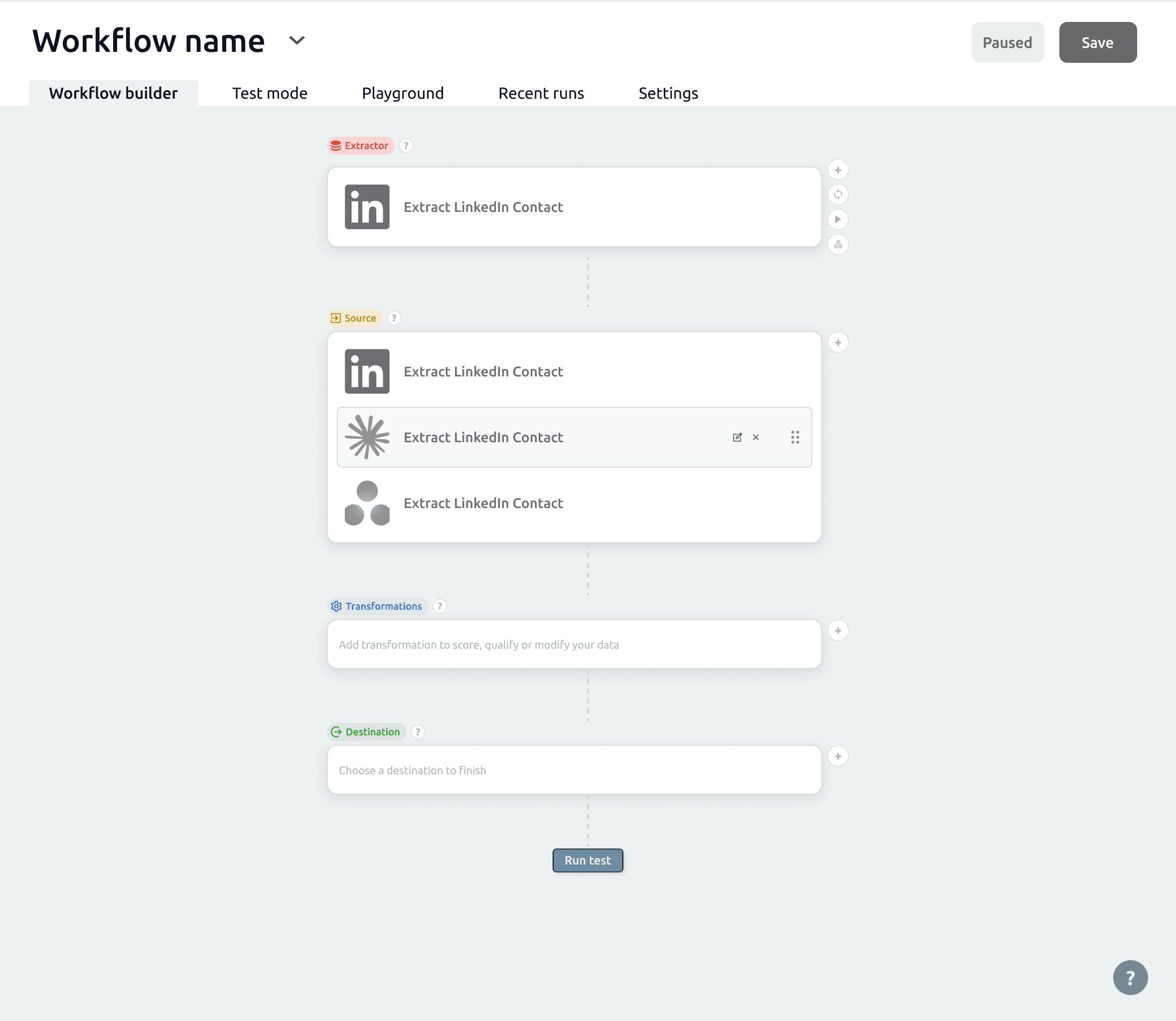
The workflow Builder
The final deliverable was a fully interactive Figma prototype covering the complete workflow builder and core product flows. The result is a linear, step-by-step experience built for non-technical users: consistent cards, a centralised action panel, and a vertical structure that lets users understand the entire workflow at a glance.
By prioritizing clarity over flexibility, the experience aligns more closely with industry standards and user expectations.
A significant part of the work was ongoing collaboration with the engineering team, from early design decisions through to final implementation, ensuring the designs were technically feasible and accurately translated into the live product.
To support consistency and scalability, I built a complete design system in Figma covering components, states, spacing, and colour logic.


Impact
Although no quantitative analytics were available, usability testing and demos feedback showed clear improvements.
Users were able to understand the workflow structure more quickly and navigate between steps without confusion. The reduction in back-and-forth interactions simplified the overall journey, and the clearer hierarchy of actions helped users focus on what mattered at each step.
The addition of a clear end action (“Run test”) improved users’ ability to complete workflows, addressing one of the initial gaps in the experience.
Overall, the final iteration resulted in a more intuitive, coherent, and user-friendly workflow builder.
Reflection
This project highlighted the importance of aligning product design with user mental models, especially when transitioning from a technically-driven product to a user-centered one.
If I were to continue improving the product, I would focus on implementing proper analytics to measure task completion and drop-off points, as well as conducting more structured usability testing. I would also explore onboarding strategies to further support first-time users.